Introducing payment approval previews to enhancing user navigation and team collaboration
Timeline
April 2024
Skills
Interaction Design, Product Thinking, Visual Design
My Team
1 Product Manager, 2 Designers, 1 Front-End Engineer
Project Context
What is Plooto?
Plooto aims to simplify and streamline payment processes for businesses by providing an all-in-one platform for managing payments, approvals, and financial workflows. Plooto provides businesses with efficient, secure, and automated payment solutions to enhance their financial operations.
How did I add value?
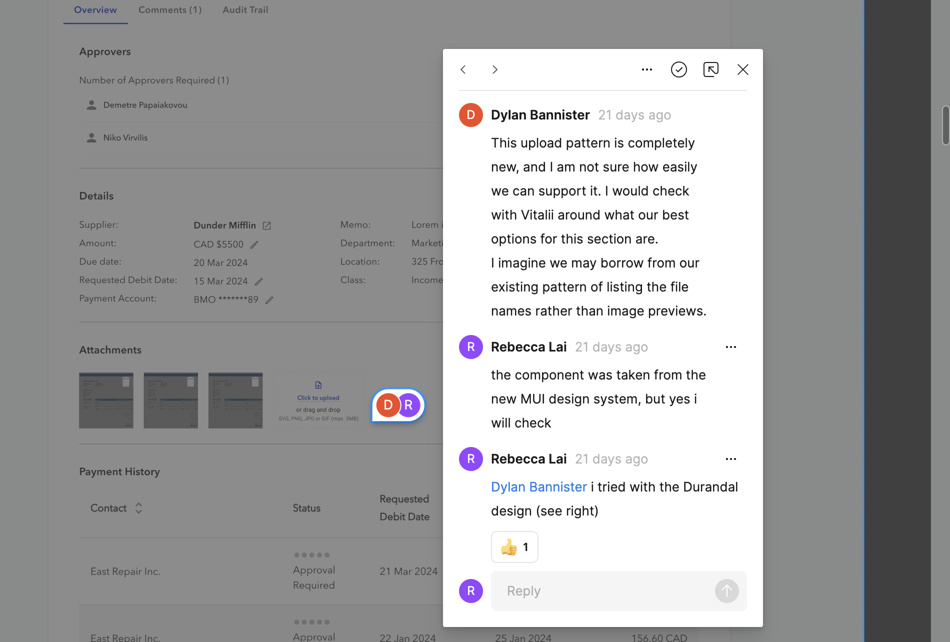
Prior to designing on this project, a previous designer had already made some designs based on some feature requirements our PM outlined. My role was to take those designs, and explore the technical feasibility, specifically, explore how we can implement this page faster. My goal was to both simplify the page for our users, as well as decrease development time.
First, let's define our problem
PROBLEM DEFINITION 🎯
Current Workflow
The current bill approvals do not have any sort of preview. Users must look through the payments page, which is a very long page with many nested components, consisting mostly of legacy design. That page was reported to have many UX issues, making it difficult for our users to find important information.
PROBLEM DEFINITION 🎯
Ticket Requirements
Working so closely with a PM was amazing because a lot of the scoping work had been done previous to me joining, and a detailed list of requirements was already finalized.
Overview Tab
Split into 4 sections
  • Approvers: list of all approvers, status of approval, and CTA to approve
  • Details: supplier, amount, currency, due date, requested date, payment account, tracking categories, memo
  • Attachments: download/view attachments, edit/delete attachments
  • Payment history: table of all previous payments made to this Supplier
Comments Tab
  • Allows for users to comment in a thread
  • Area to post a comment will include the input text box and a button used to post the comment
Audit Trail Tab
Show history for
  • When the payable was created (timestamp), and by who (user)
  • Approval decision, by user
  • Any edits to the Details of the payment
  • Changes to attachments (added or removed), with who + timestamp
  • When the payment becomes fully approved + timestamp
Next, let's conduct some research
PRIMARY RESEARCH 🔍
User Interviews
Many users had expressed pain points with this page. We leveraged feedback gathered prior to the start of this project as our source of “primary research.”
Below is a list of the “UX bugs” we found:
  • Users cannot find the “collapse” and “expand” buttons for accordion components
  • Information hierarchy unclear
  • Too many chevron buttons in the same line make it difficult to understand what each button does
  • Required approvers are unclear and easy to miss
SECONDARY RESEARCH 🔍
Competitive Analysis
For each of the subtabs within this preview page, I conducted competitive analysis to explore some existing user experiences. Through the research process, I posed as a client and discovered many pros and cons of each application I tested.
What did we learn from competitive analysis?
  • Limit nested components -> adds complexity for development & more confusing for users
  • Dividers or containers to distinguish between sections
  • Follow standard design patterns for commenting, threads, replies
  • Timeline component preferred because it is intuitive and part of our component library so it's easy to implement
Now, let's get to ideating!
IDEATE 🖋
Mid-Fidelity Designs & Feedback
Due to the very tight timelines, there wasn’t much time to explore UX improvements in low-fidelity. Instead, I went straight into mid/high-fidelity designs, asking for feasibility feedback from our Staff Front End Engineer with each design decision.
ITERATE 🔁
Design Decisions
Below are a few design decisions I made to enhance the designs taken from a previous designer.
Decision #1: "Back to Approvals"
Initial Design
Having multiple chevron buttons in the same line makes it confusing to users. Which chevron is navigating back to the approvals page? Which chevrons are navigating between list items?
Final Iteration
Adding "back to approvals" copy helps users know what the button does. Surfacing it outside of the approval preview helps better distinguish the hierarchy of the page.
Decision #2: Required Approvals
Initial Design
There was previously no indication of whose approval is required for the payment.
Final Iteration
Adding required chips to better indicate whose approval is required.
Decision #3: Attachments
Initial Design
It was annoying for users to have to go to a different page to add or delete attachments.
Final Iteration
The layout for each attachment was changed to make the preview larger and to include a delete option. A drop area was added for adding attachments.
Finally, it's time to present final designs!
PROTOTYPE 💻
Final Designs!
Click through the prototype below to see the final designs:
Reflecting on this project...
REFLECTIONS 💭
Lessons Learned
The importance of a low-fidelity stage in the design process
In order to try to meet our tight timelines, we skipped over the low-fidelity stage of our design process. Yet, without finalizing the UX of the platform, a lot of my Figma iterations ended up being scrapped. When designing in low-fidelity first, I can eliminate my tendency to get carried away setting up components and variables and just focus on the first task at hand: designing the UX.
REFLECTIONS 💭
Next Steps
Explore accessibility
Something that Plooto has recently been striving to improve is its accessibility. Alongside this project, I have also been working on design system work, specifically, on writing documentation to outline our design standards. Unfortunately, some parts of the experience is legacy design, which I could not change due to the amount of dev work it would require. With more time, I would look into updating our designs to fit certain design best practices while staying within the limitations.
Iterate, iterate, and iterate more!
Due to our tight timelines, we did not have the time to iterate our designs, but rather just went with the first hi-fi designs I provided. Given more time, I would advocate to further iterate my designs after receiving feedback from our engineers and PMs.
STILL NOT CONVINCED❓
Check out some of my other work below!
Interaction Design
Product Thinking
Designing an AI-Powered Literature Summarization agent for modern labs
Revvity | June 2025
Interaction Design
User Testing
Scaling an Agentic AI interface to support 100+ AI agents
Revvity | July 2025