Intro & ContextProblem DefinitionIdeateFeedback & IterateFinal Designs
Reimagining patient samples data visualization for web accessibility
Timeline
June 2025
Skills
Product Thinking, Interaction Design, User Research
My Team
1 Product Manager, 1 UX Design Intern, 1 UX Research Intern, 3 Engineers/QA
Project Context
What is Revvity?
Revvity aims to improve health outcomes by empowering scientific discovery and diagnostics, offering leading solutions in diagnostics, life sciences, and analytical lab technologies. Their products include reagents, instruments, and software for disease research, drug development, and clinical testing.
What is NeoLive?
NeoLive is a Revvity imaging platform designed for advanced live-cell imaging and analysis. NeoLive helps researchers in drug discovery, cell biology, and other life science fields to observe and analyze cellular responses in real-time, providing deeper insights into biological mechanisms, drug effects, and disease processes. The platform enables scientists to capture dynamic cellular events that might be missed with traditional fixed-cell imaging approaches.
First, let's define our problem
PROBLEM DEFINITION
Current Workflow & Scope
Currently, NeoLive is an outdated desktop app full of old legacy design that no longer aligns with Revvity's current branding or any design best practices.
The team presented me with a mockup of the aspects of the desktop app they wanted to keep. The initial scope was to keep the user experience the same, and simply redesign the UI.
Now, let's get to ideating!
IDEATE
Low/Mid-Fidelity Mockups
Due to tight time constraints, we did not have time to do proper UX research prior to starting ideation. Instead, I began ideating while the UX researcher looked to validate some of my design decisions in tandem.
Next, it's time to get some feedback & iterate
FEEDBACK
Design Critique!
Because we did not have the time to research, we agreed to get feedback as early and as often as possible. Team NeoLive has weekly 3-in-a-box meetings. A "3-in-a-box" is a specific team meeting where only the lead PM, lead engineers, and lead designers sync on new ideas and concepts. Hence, the 3 (design, product, and engineering) in one box.
With each iteration, I leveraged these weekly meetings to get design critiques from the product and engineering functions of my team.
What did we learn from design critique?
  • It might not be evident that the plate view and table view show a repeat of the same information
  • Too much colour → flags get lost amongst the other colours
  • Maybe add text to indicate what the errors are / correction for errors
  • Selected state should appear over the flagged columns as well
  • Ultimately: we knew we needed to present our designs in front of some users to truly understand their workflow
FEEDBACK
Usability Testing
From the feedback received during design critique, I designed a few different A/B versions of the interface to present to our users.
What did we learn from usability testing?
  • Some information on the table don't provide much value → users were unsure what the numbers mean
  • Consider Jobs-To-Be-Done: Once a well is selected, users would like to focus on the selected samples only
  • Rework order of columns to reflect what users tend to be searching for in the table
  • Some users would like sorting and filtering options for both tables
  • Users would like more visual indication for which plate's samples they are currently viewing
ITERATE
Design Decisions
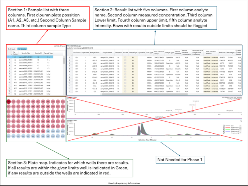
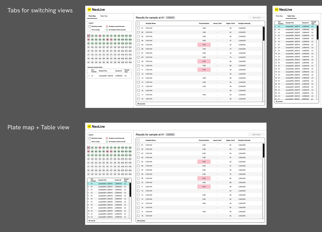
Design decision: adding tabs to toggle between views
One common feedback we received was that users were unaware that both the plate view and the table below it were displaying the same information. A recommendation from the design team was to use tabs to toggle between the views.
First iteration
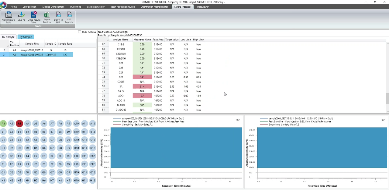
Matches the experience of the legacy desktop designs → older users are familiar with it
Some users thought they would have to first select a well in the plate view, then select a sample in the table → unclear they both display the same information
A lot of information and not enough real estate to display it → table view is very squished
Final version
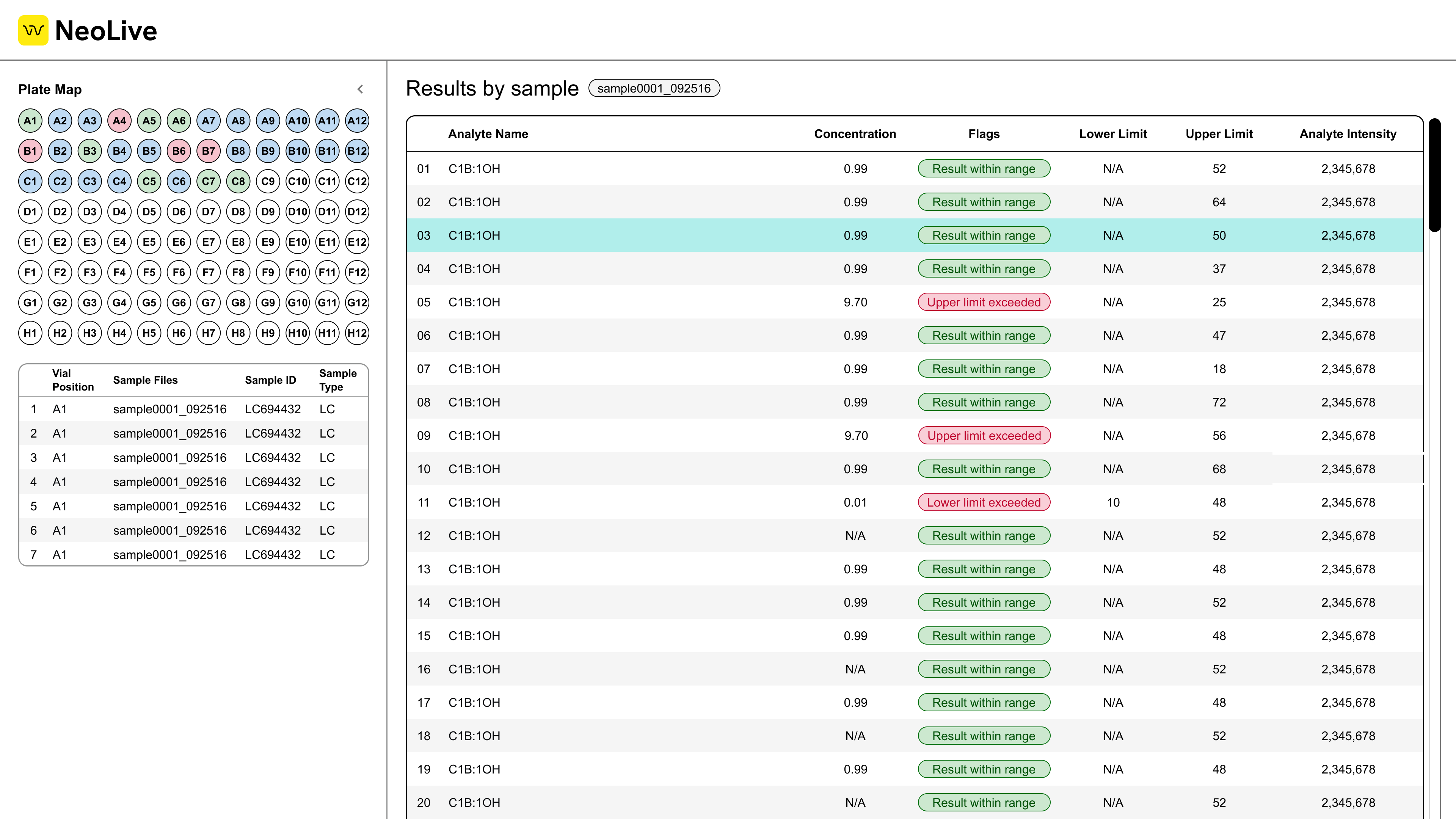
Clear distinction between plate view and table view
Still displays all the information found on the table view for selected sample
This design change was out of scope of the original team ask to simply update the UI and not change the UX. However, after presenting our research, design arguments, and user feedback, we were able to convince the team to implement this change.
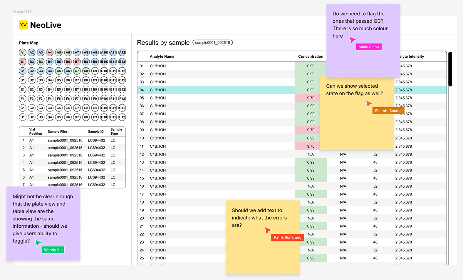
Design decision: indicating QC flags
Another decision was on how to indicate QC flags. Through user testing it was deemed that most users use our interface to check on the status of their samples. After speaking with the design team we decided that only the error flags were necessary to draw attention to.
One thing to keep in mind is that the flags must still be visible when the row is selected.
Filled cells
Pills to indicate flags
After speaking with the design team we decided that only the error flags were necessary to draw attention to (think about Jobs-To-Be-Done!). The current use of colours make the interface look visually noisy, so we removed as much colour as we could except for the flags.
Final version
ITERATE
Accessibility Testing
One concern the design team had was the accessibility of my designs. Since we were using colour as the sole indicator for flags, we wanted to ensure that users with visual impairments would still be able to interact with the interface.
To address this concern, I ensured the contrast between the red flagged samples and the green (good) samples was high enough. After selecting a higher contrast colour, and inverting it (dark background, light text), I passed the designs through colour blind simulators to double check.
Tritanomaly
Deuteranomaly
Protanomaly
Tritanopia
Deuteranopia
Protanopia
Achromatopsia (complete colour blindness)
Finally, it's time to present final designs!
PROTOTYPE
Final Designs!
Click through the prototype below to see the final designs:
FINAL DESIGNS
Polishing for Handoff
Before handing off I went through the flow and fixed up some small details, ensuring all screens were pixel perfect and aligning with the design system.
One important note: we provided different versions of the designs because the both the UX team and the business unit had differing opinions on the design decisions we made. We provided a version of the designs that the business unit wanted, as well as a research-recommended version. The business unit agreed that they would consider the research-recommended designs once they had more development resources to implement it.
STILL NOT CONVINCED?
Check out some of my other work below!
Interaction Design
Product Thinking
Designing an AI-Powered Literature Summarization agent for modern labs
Revvity | June 2025
Interaction Design
User Testing
Scaling an Agentic AI interface to support 100+ AI agents
Revvity | July 2025