Intro & ContextProblem DefinitionResearchIdeateFeedback & IterateFinal DesignsReflections
Streamlining onboarding to increase trialist to client conversion on our Salesforce platform
Timeline
June 2023 - August 2023
Skills
Product Thinking, Interaction Design, User Research
My Team
1 Product Manager, 1 UX Design Intern, 1 Design Mentor, 4 Engineers
Project Context
What is Gearset?
Gearset is a DevOps tool for the Salesforce platform that helps clients deliver change for comparisons, deployments, automated testing and backups.
How did I add value?
As a designer on the Growth team, we focus on the business side of things, like how to convert more trialists into paying customers. The main thing I worked on during my internship is improving our onboarding flows to bring users to their “aha” moment quicker; an “aha” moment is the moment where users see the value of our product and are enticed to purchase a license. The result was an increase in trislist to client conversions by nearly 61%.
First, let's define our problem
PROBLEM DEFINITION
Current Workflow
Currently, the “onboarding” process is facilitated by a dismissible wizard that has been reported as confusing and not user-friendly. Users expressed distrust when connecting their Salesforce organizations, and would like more guidance in the platform on what to do.
How might we design an onboarding flow that is intuitive, efficient, and ultimately brings our users to see the value of our product sooner?
Next, let's conduct some research
PRIMARY RESEARCH
User Interviews
To better understand our users, I watched the previously recorded user interviews and annotated the current flows with major pain points.
Overview
Salesforce admins are often not technically skilled (in coding, etc.), and receive pressing demands from multiple business units to improve efficiency.
Motivations
  • Want quick and easy deployments
  • Want to be able to confidently connect organizations and trust the platform
Pain Points
  • Too much confusion on the landing page, unsure about where to start
  • Current quick compare lacks context and guidance
  • Too many decisions to make upfront that seem unecessary and feel overwhelming
Overview
Salesforce developers are used to complicated software and do not like repetitive tasks.
Motivations
  • To improve efficiency
  • To streamline and automate processes
Pain Points
  • Do not like unnecessary steps
  • Current process has too many decisions to make upfront
  • Existing guidance feels limited and still have a lot of unanswered questions
  • It is unclear as to why there is a different flow for seemingly the same task
Overview
Release Managers are typically familiar with Git, and are responsible for streamlining the release process in companies.
Motivations
  • Want a flexible, reliable workflow
  • Has a desire to automate releases
Pain Points
  • Expecting more (visual) confirmations for when certain tasks have been successfully completed (i.e. connecting organizations)
  • Hesitancy in trusting Gearset with their organizations right away
  • Similar frustrations to the Salesforce Developers
SECONDARY RESEARCH
Competitive Analysis
I then conducted competitive analysis, and looked at some existing successful onboarding flows. I posed as a user, taking notes for each platform.
What did we learn from competitive analysis?
  • Incorporate branding into onboarding flow
  • Some sort of “success” message/visual indicator helps users know when onboarding has been successfully completed
  • A simple stepper to show progress helps users anticipate how much time and effort onboarding will take
  • Option to skip unnecessary steps within onboarding or skip onboarding altogether and go straight into the app prevents users from feeling "trapped" in the flow
Now, let's get to ideating!
IDEATE
User Flow Diagrams
To begin reimagining our workflow, my mentor taught me the “UX ShorthandUX shorthand” for sketching out low-fidelity design ideas. This shorthand allows us to visualize the user experience of the platform without getting distracted by the visual elements.
Once we had the rough outline of the user experience, we took our designs to Figjam and began outlining a rough idea of the different flows we could explore.
IDEATE
Low-Fidelity Wireframes
With the general page layout complete, I continued refining the designs to be more mid-fidelity. In the end we came up with two possible solutions to our problem space: one being an entire flow of step-by-step onboarding, and the other being a simplified flow with default connections.
Next, it's time to get some feedback & iterate
FEEDBACK
Design Critique!
Next it was time to get formal feedback from the team.
I found it very useful to have run two separate design critiques with different teams. With the engineering team, I received feedback on the important feasability concerns to keep in mind while designing. With the customer success team, I received feedback on the main flows customers tend to call to ask for help.
What did we learn from design critique?
  • Some users do not understand the difference between “Sandbox,” “Production,” and “Development”
  • We want to remove the option to connect using Username / Password since this limits Gearset’s functionality
  • Most of the settings are not applicable or helpful at this point in the onboarding → users can always change their connection settings at a later time
  • We don’t actually need to ask users for the org type we are connecting since we get that information from their connection details
  • Users need to know what default filters are being applied to their comparisons or they may be confused as to why certain metadata isn’t being included
ITERATE
Stripping Down Designs
The feedback from both design critiques inspired us to totally change our original design direction. We discovered that many of the steps in our original onboarding were unnecessary and that we could significantly shorten it.
Prototype prior to removing unecessary steps
Simplifying the prototype from ~13 screens to 1 was the most satisfying part of our design process. The result was a one-page comparison screen for which we designed two different approaches.
Version 1 (dropdown)
Version 2 (buttons)
MORE FEEDBACK
Usability Testing
For usability testing, we recruited participants who are new to Gearset, so that we could get the most accurate data on a user’s first impression of Gearset through the onboarding.
Research goals
  • To validate that the proposed new solution is simple, intuitive and provides our users with enough guidance to complete the flow
  • To ensure our proposed new solution both makes the new user experience better and does not confuse our current users
Research questions
  • Are our users completing the flow all the way to the end?
  • Does the proposed new solution decrease the time taken for our users to reach an “aha” moment?
What did we learn from usability testing?
  • More help documentation would help our users trust our platform more
  • Users would like more guidance and recommendations → What kinds of organizations do we recommend our new users to connect?
  • Users would like to know the expected time for each comparison type
  • Some users may not want to compare organizations right after connecting them → would like an option to see what organizations they currently have connected and what other steps they can take
ITERATE
Design Decisions
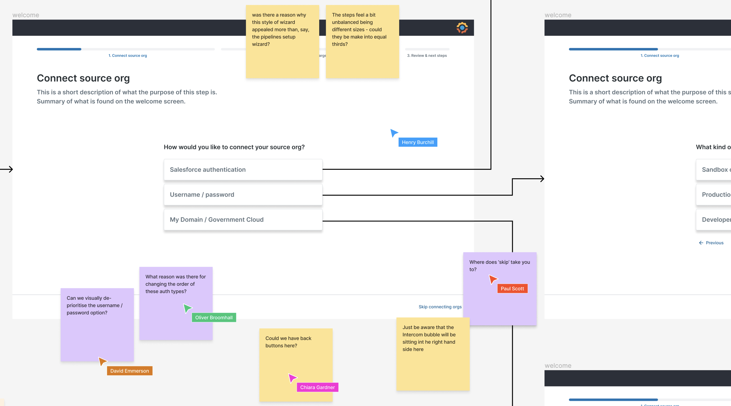
Design decision: button vs. dropdown
The main design decision was on how to present the “Connecting Organizations” interaction. The following pros and cons were gathered during usability testing.
Less clicks to connect organizations
Buttons were reported to be confusing – some users could not tell they were buttons and thought they were “boxes"
Less information presented upfront
Takes up less of the screen real estate
More similar to other interactions users have seen in competing apps
Cannot see all the options available unless user clicks on the dropdown
One extra click to connect organizations
We ultimately picked the dropdowns because we noticed that those who preferred buttons had no issues completing the flow with dropdowns, but those who preferred dropdowns preferred it because the buttons were too confusing.
Design decision: providing more guidance
Another decision was to provide more guidance in the case where our users do not know where to start. One consideration was to include a walkthrough demo, but that was deemed intrusive to existing users' experience. So the conclusion was adding a simple link to a user guide.
Design decision: encouraging users to complete flow
We also updated our designs so that the "Back to landing page" CTA was separated from the primary CTA to complete the flow. This was to discourage our users from going back since it does not follow the natural eye tracing pattern.
Finally, it's time to present final designs!
PROTOTYPE
Final Designs!
Click through the prototype below to see the final designs:
FINAL DESIGNS
Polishing for Handoff
Before handing off I went through the flow and fixed up some small details, ensuring I was following the design system for typography, spacing, padding, and colours. I then prepared the designs for handoff to the engineers using Figma Dev Mode. I wrote documentation outlining the interactions, components (& states), and any other notes that may be helpful for implementation.
Reflecting on this project...
REFLECTIONS
Lessons Learned
Delivery > deliberation
It is a very startup model to prioritize delivery over deliberation. I’ve learned that there is a lot of value in pushing out feature updates sooner and observe the user feedback rather than spending more time polishing a design to be “perfect.”
No design work is ever wasted
Throughout this internship there were so many times when a piece of user feedback would completely change our design direction. Every time that happened, I had to drop everything and switch gears to explore different interactions, flows and design patterns. Although it was challenging (and sometimes discouraging), I’ve learned to be adaptable.
Something my design mentors here at Gearset have taught me is that no design work is ever wasted. It’s difficult to know which design is the “ideal” design, since the world of tech is always changing. What might work for one user might not work for another. I’ve learned to document and keep every iteration because sometimes we may change directions so that one of our older iterations could inspire a new design!
Sketch first, Figma last
I’ve learned that when I go straight into designing in Figma, I tend to get distracted by the visual elements and making everything look “pretty.” Yet, without finalizing the UX of the platform, a lot of my Figma iterations end up being scrapped. When using a UX shorthand and sketching on paper, I can eliminate my tendency to get carried away setting up components and variables and just focus on the first task at hand: designing the UX.
REFLECTIONS
Next Steps
Testing, testing and more testing!
No matter how much user testing has already been conducted, you can never have too much user feedback. After the first round of usability testing, we made quite a few changes to our final designs which could be validated with more usability testing.
Explore accessibility
Accessibility is something every company, regardless of the size and industry, should constantly strive to improve. Something I think is worth exploring is how responsive the designs would be with font size changes, and how compatible our content is with screen readers.
Dynamic experience to cater for all kinds of users
Another thing I think is worth exploring is how we can make our experience more personalized depending on the user type. For example, in this case study we focused on the Salesforce Administrator (the less tech-savvy) persona. While simplifying the process may work better for Salesforce Administrators, it may not be the ideal design for Salesforce Developers, who are used to more complicated programs and may sometimes prefer having that complexity.
STILL NOT CONVINCED?
Check out some of my other work below!
Interaction Design
Product Thinking
Designing an AI-Powered Literature Summarization agent for modern labs
Revvity | June 2025
Interaction Design
User Testing
Scaling an Agentic AI interface to support 100+ AI agents
Revvity | July 2025