Design decision #1: choosing a centralized entry point
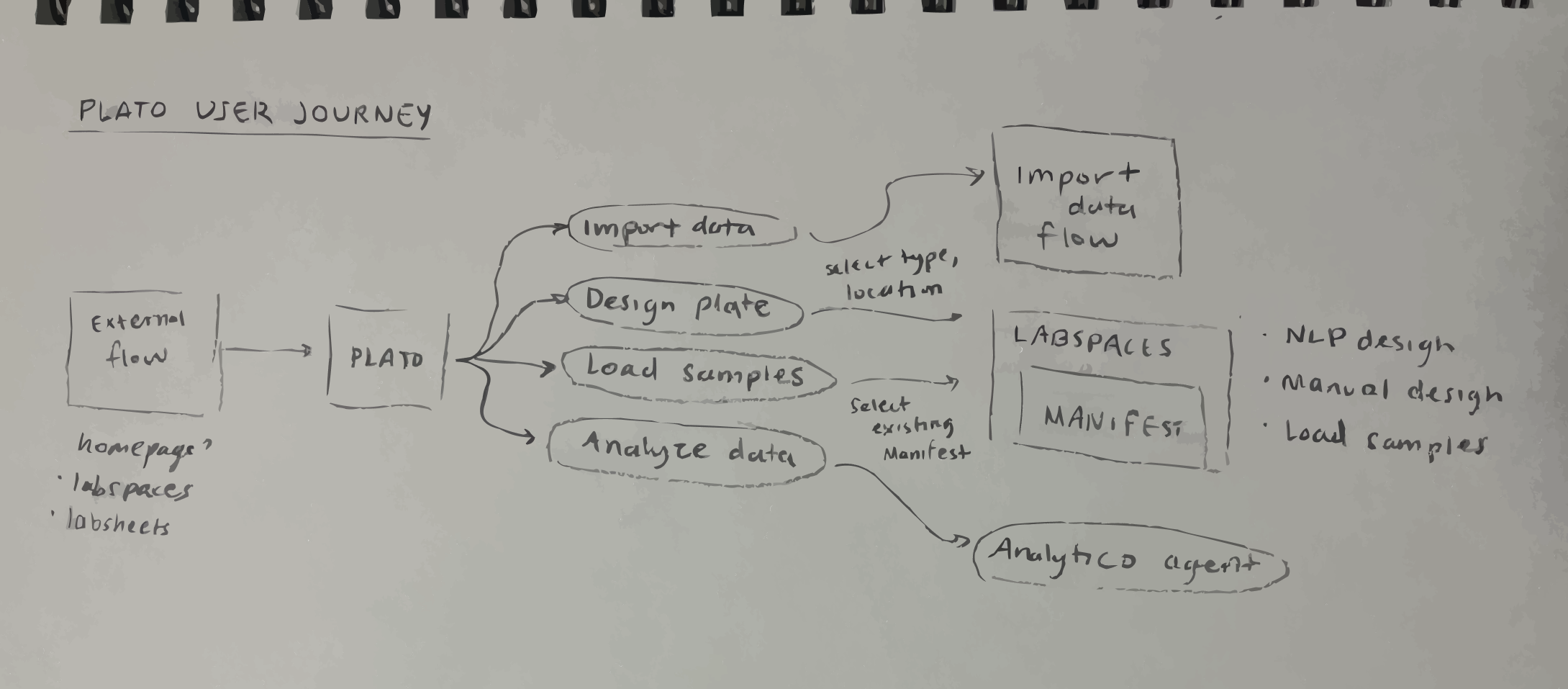
I considered a few options for a centralized entry point:

Homepage

Its primary role is to introduce the platform rather than provide workflow-specific tools

Could use an onboarding experience here, but that only makes sense the first few times and would become cumbersome for seasoned users

Results analysis spreadsheets

Only makes sense if plate workflows were exclusively tied to data analysis

Lacks the flexibility to support the entire workflow

Lab Processes Tracking App

Does not naturally align with the hands-on, experiment-focused nature of plate workflows

Note-taking App

Users rely heavily on this app to plan experiments, and plate workflows are contextual to specific experiments

Ensures that users encounter it in their natural workflow, maintaining continuity
Some things I considered when making this decision include:
Design decision #2: page architecture
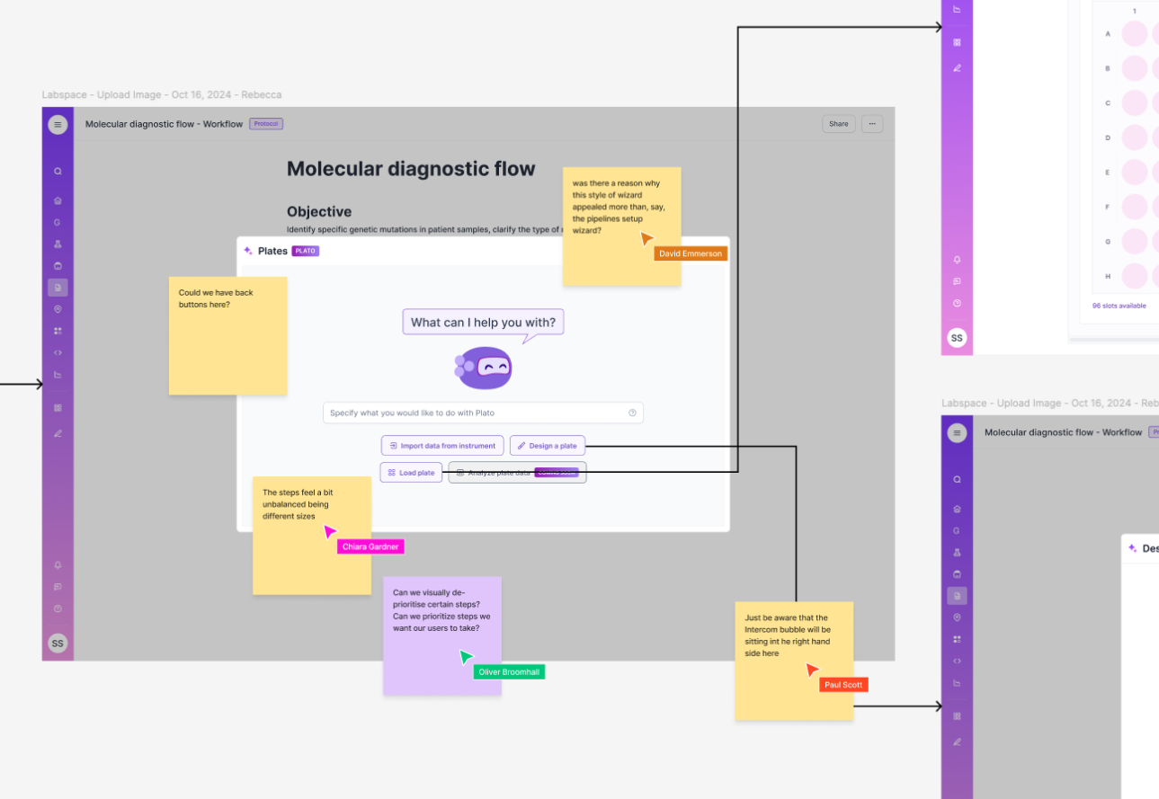
Where on the page should we introduce this feature?

Embedding the feature as a button or toolbar

Simplicity and a clean interface

Lacks sufficient context

Leveraging our platform's backslash embedding feature

More contextualized approach

Allows users to interact with plates in a familiar format while maintaining a clear association between Plato and plate workflows
Some things I considered when making this decision include:
How often do I envision our users using this feature?
How can I introduce Plato in a way that both explains what it is to new users AND does not get in the way of existing users’ experience?
How does this feature scale? What if our user wants to embed many plates into one page?
Design decision #3: modal or fullscreen?

Fullscreen

More real estate, allowing for detailed guidance and context for onboarding new users

Allows for a more immersive experience where the entire screen is dedicated to the feature

Risks isolating users from their primary workflow (creates the impression of navigating to a separate area of the platform)

Users may lose context of the experiment they were working on

Modal

Balance between providing enough space for functionality and maintaining the user’s context within their current workflow

Allows users to interact with Plato as an embedded component of the note-taking app (reinforcing its role as an extension rather than a standalone tool)

Offers less space than fullscreen designs (to work around this, I prioritized content and chose a clean, structured layout to not overwhelm users)
Some things I considered when making this decision include:
How much time do users typically spend (or want to spend) engaging Plato? Are users likely to want a quick interaction or a deep dive into this feature?
How much screen real estate is necessary to display the feature’s content effectively?


.gif)